Features of this template :
- Responsive blogger template both of desktop and mobile view
- Support Template designer. You can edit the background image, font family, font size, font color and others in Template Designer
- Featured image slider with auto recent post per label
- Minimalist and clean design template
- Compatible with modern browsers
- 2 column template
- 3 column footer
- and more
* Don't forget to see Update Main Photo responsive Blogger template
I don't set up the menu navigation. You can create it as you want. for the search box and subscribe via email, it's a default from Blogger. You can add it from Layout section.

Setting Main Photo Responsive Blogger template
1. General setting
Before install this template, make sure to change the mobile view.Go to Template > click the Gear icon > click Yes. Show mobile template on mobile devices. > choose Custom (please see the image below)

* this setting recommended if in your current setting for mobile view is No. Show desktop template on mobile devices
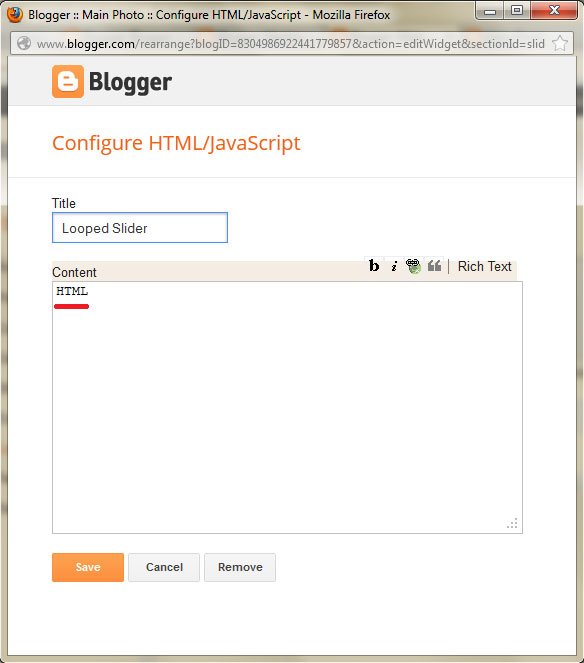
2. Setting Featured Image Slider
This template support image slider with auto recent post per label/category. You just need type the Label name in widget section.Go to Layout > click "Edit" Looped Slider widget
* Case sensitive. make sure you write correctly
3. Setting social networks
Go to Design > Edit HTML > Proceed and find this code below :<div class='network'>
<ul>
<li><a href='https://twitter.com/ireng_ajah'><img alt='Twitter' src='https://blogger.googleusercontent.com/img/b/R29vZ2xl/AVvXsEhk3uEQwaWSRNHw4i65a5Bzu4TL7v4I8uSNkeXxD-fdjt6GDnbeaNAtKecOHrIm6amW4lFcLegM6Bp0IbdElb-3pow2HL_B07nMLA07edMfajUNCCWENuLQ65zBo5pJHFwW64LQKUSPQWX2/s1600/twitter.png' title='Main Blogger on Twitter'/></a></li>
<li><a href='https://www.facebook.com/MainBlogger'><img alt='Facebook' src='https://blogger.googleusercontent.com/img/b/R29vZ2xl/AVvXsEgDWZsST4o26ml3KecU4MwsDppL5uCWdEp-vWp2Nk3WsME8BtoLCrChKrai5PZQCY9lI3NG2bFxZ5HJAzMJ2KW16jLN6fUReiRb7SOBwhuEprPg67V72mCJLqeNFAN4jJB0eQxSecd_JPtF/s1600/facebook.png' title='main Blogger on Facebook'/></a></li>
<li><a href='https://plus.google.com/111461490683022468168'><img alt='Google+' src='https://blogger.googleusercontent.com/img/b/R29vZ2xl/AVvXsEivo6KmyeC3h3-q_62BPJXhN_8gR72Cn_T6ZOo3Z3xQoycHXEIk0UJXuOlqTaBkeq2UaMAds0o9Ei5ZkaSK16DvbpVAjx9OqcQRP85kWofvsyTHbE4i1S0109QOsaL-xecvcAAmj1a5ndfK/s1600/gplus.png' title='Main Blogger on Google+'/></a></li>
<li><a href='http://feeds.feedburner.com/mainbloggerz'><img alt='RSS Feed' src='https://blogger.googleusercontent.com/img/b/R29vZ2xl/AVvXsEhiyP5ARKV1Znajcp9EcNDPGNtJxfp_E7W3RXfbIqH5N7jGibkHDU4dpdQZEjkY1dtWtC8scMs31NcwF34OR_SareRnvLVNBVmdN2p76AOtDSOz8MSsZMHt8MU0YSW_HJISrRJ0AGveMnHA/s1600/rss.png' title='Subscribe RSS Feed Main Blogger'/></a></li>
</ul>
</div>
4. Setting Menu navigation on Bottom
Go to Design > Edit HTML > Proceed and find this code below :<div class='creditl'>
<ul>
<li><a href='/'>Home</a></li>
<li><a href='/p/about.html'>About</a></li>
<li><a href='/p/advertise.html'>Advertise</a></li>
<li><a href='/p/contact-us.html'>Contact Us</a></li>
</ul>
</div>
5. Setting Banner Ad 125*125px
For perfect view, the structure of banner ad 125*125px should be like this<ul class='ads'>
<li>YOUR_LEFT_BANNER_CODE_HERE</li> <!-- Left banner -->
<li class='last'>YOUR_RIGHT_BANNER_CODE_HERE</li> <!-- Right banner -->
</ul>
6. Setting Widget on Mobile
To display widget on mobile or/and desktop, you can add these codes
mobile='yes'
mobile='no'
mobile='only'
For example, you want to add Popular Post widget. Default Popular Post widget look like this :
<b:widget id='PopularPosts1' locked='false' title='Popular' type='PopularPosts'/>
Then, you want to display on mobile too. So, the Popular Post widget code should be like this
<b:widget id='PopularPosts1' mobile='yes' locked='false' title='Popular' type='PopularPosts'/>
* just add
mobile='yes'For more detail, you can see on this post
* By downloading and using this template, you agree with our Term & License
0 Comments